Wednesday, 27 February 2013

Magazine concepts (part 1)


Main differences include:-

The titles and colours used give off a whether the magazine its a friendly or serious attitude towards the content, the "HELLO!" magazine shows boxed writing to show that theres differences in the informations being written.The smiley faces and the glamourised celebrity photos show how this magazine describes the perfect world in which celebrities and stars are idolised by people and the audience. The inclusion of the other images show that they have more to offer rather than just whats shown as their main image.

Total film used more bold text with a sole main image to capture the seriousness of their own concept, they try to draw as little attention away from the centrepiece and the main feature. the bold writing of "Total FILM" links with the bold headline of "STAR TREK" to show its importance of the magazine. the black and white theme makes it easier for writing at the top to be easily readable and to stand out partly.

The typically lesser known magazine "WOOD" does have its own concept with a main image to the side and text spreaded around it to show its informational value and informative text, it has to give the audience more value for money due to it being a lesser known magazine compared to others. The brief bright colours with orange and yellow show how it  changes titles with text being white. The white writing at the bottom is separate to give audiences an eye catching text brief.

Tuesday, 26 February 2013

Magazine Covers


Good:
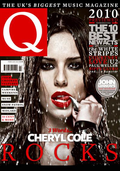
The effects to get such a clear resolution in the picture
The mode of address shows the theme of "sexiness" and "danger"
The text size and colour do not draw attention away from the main image or the logo
The Sell Line is short and sweet and lets the audience know which magazine is the best choice for them
The Main headline gives little away about whats in the magazine so therefore the audience have to look inside to get a glimpse of whats going to be in there.

I chose this magazine due to the effects used to make it stand out and it gives it  a more dark and deeper feeling to the magazine rather than the other magazines which feature bright and colour images and text to
 make it stand out and this magazine has opted for the opposite which in turn makes it stand out more.

url.jpg

Good:
The Stand out image is good due to its him (Kanye West) with a straight face to show him  in a neutral state
The colours used give off a laid back approach and a more happy upbeat tone rather than what he is usually known for which is dark colours and deeper colours
The way the text is placed around him and the way he appears before the Title of the magazine only enhances his significance

I chose this magazine due to its use of bright colours which don't dispute Kanye's masculinity but they also give him a sense of humanity with a human touch. The use of colours in the font and text make Kanye stand out, the clothing used give Kanye a more sensitive touch rather than his usual typical all black outfits and clothing.


Good:
The use of shading to produce a sinister more evil look to the main image
The use of a famous cartoon character at christmas with a reference to a man associated with being bad shows the season in use as well as not losing their serious touch
The almost secretive use of baubles give off the christmas touch as does the themed title of NME with snow along the roofing 
The background is good as although dark it doesn't take any credit away from the main image and the wallpaper remains christmas themed

I chose this magazine due to its use of colour and portrayal of the christmas theme. This is different to the other magazines as he is shown as evil without the content surrounding the main image being over the top in terms of displaying the theme. They (the magazine) have mixed themes of christmas and an evil sinister type due to the character being featured is often stereotypically portrayed as a villain in society but a loveable one that people can compare to the grinch


Good: The extremely dark and scary pictures indicates a dark feeling towards the main image and the featured. The images are spaced around to include the whole of the band which could be difficult for Kerrang who specialise in cramped and crowded magazine covers, the Bold "Slipknot" shows the boldness and importance of the band to stand out. The sharp pointy objects also relate to the theme of danger which is portrayed by the use of the masks in the main image.

I chose this magazine because it shows the extremes of one theme which is the theme of scary. The use of props is rare and Kerrang has took it to the extreme by using very intimidating clothing and masks. the use of stand out colour in the text and font show how to make important pieces of text stand out. Kerrang has used a number of different images along te bottom without taking credit away from the main image as they arnt made to stand out due to the colours used


Friday, 15 February 2013

Lilly Allen Analysis NME


This is a magazine analysis of a magazine i have found from the internet, it is on Lilly Allen and it is an NME edition.


Leeds Festival 2012 (Highlights)

This is a highlights video from the leeds festival 2012. The reason i am uploading this video is because it is relevant to my studies of genre as it assumes the genre of rock which is the genre that I am basing my studies around e.g. Rock


Tuesday, 12 February 2013

Questionnaire Results


Here is my questionnaire results, thank you for participating ........


These results show me the mean age of people who read music magazines are male and aged between 14-17. This also tells me the favourite Genre of music that people prefer is Rock and Roll and that the majority of people will pay £3.51- £4.00 for a magazine.

Basic Music Magazine Layout


This is a basic example of what a music magazine's layout tends to replicate. The contents page style varies from magazine to magazine depending on their house style. I will replicate this contents page later on in the course

Monday, 11 February 2013

Music Genre choice


My genre choice is of Rock due to it being the highest and most popular choice of music magazine as done in the questionnaire. A brief intro about rock is that its probably the most well known music genre in the world and its most popular time was in my opinion in the 80's, it inspired hundreds of bands to pursue this genre as it attracted huge audiences and its importance in developing other genres cannot be understated.

Music Genres have originated from one specific genre then they have evolved over time, they have originated from The Blues which was the first music genre. Similarities can be seen in today's music genres such as hip hop has some similarities with rap and they are both related closely to pop. aNOTHER EXAMPLES

Bands that represent Rock are

ACDC
Metallica
Guns n Roses
AC/DC


Magazines that represent sub genre:

Rock Express
Rock Sound
Rock
Kerrang