Good:
The effects to get such a clear resolution in the picture
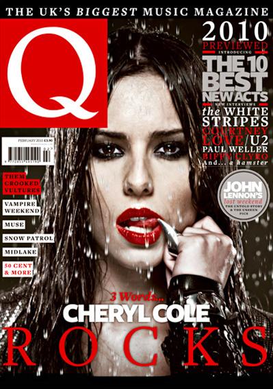
The mode of address shows the theme of "sexiness" and "danger"
The text size and colour do not draw attention away from the main image or the logo
The Sell Line is short and sweet and lets the audience know which magazine is the best choice for them
The Main headline gives little away about whats in the magazine so therefore the audience have to look inside to get a glimpse of whats going to be in there.
I chose this magazine due to the effects used to make it stand out and it gives it a more dark and deeper feeling to the magazine rather than the other magazines which feature bright and colour images and text to
make it stand out and this magazine has opted for the opposite which in turn makes it stand out more.
Good:
The Stand out image is good due to its him (Kanye West) with a straight face to show him in a neutral state
The colours used give off a laid back approach and a more happy upbeat tone rather than what he is usually known for which is dark colours and deeper colours
The way the text is placed around him and the way he appears before the Title of the magazine only enhances his significance
I chose this magazine due to its use of bright colours which don't dispute Kanye's masculinity but they also give him a sense of humanity with a human touch. The use of colours in the font and text make Kanye stand out, the clothing used give Kanye a more sensitive touch rather than his usual typical all black outfits and clothing.
Good:
The use of shading to produce a sinister more evil look to the main image
The use of a famous cartoon character at christmas with a reference to a man associated with being bad shows the season in use as well as not losing their serious touch
The almost secretive use of baubles give off the christmas touch as does the themed title of NME with snow along the roofing
The background is good as although dark it doesn't take any credit away from the main image and the wallpaper remains christmas themed
I chose this magazine due to its use of colour and portrayal of the christmas theme. This is different to the other magazines as he is shown as evil without the content surrounding the main image being over the top in terms of displaying the theme. They (the magazine) have mixed themes of christmas and an evil sinister type due to the character being featured is often stereotypically portrayed as a villain in society but a loveable one that people can compare to the grinch

Good: The extremely dark and scary pictures indicates a dark feeling towards the main image and the featured. The images are spaced around to include the whole of the band which could be difficult for Kerrang who specialise in cramped and crowded magazine covers, the Bold "Slipknot" shows the boldness and importance of the band to stand out. The sharp pointy objects also relate to the theme of danger which is portrayed by the use of the masks in the main image.
I chose this magazine because it shows the extremes of one theme which is the theme of scary. The use of props is rare and Kerrang has took it to the extreme by using very intimidating clothing and masks. the use of stand out colour in the text and font show how to make important pieces of text stand out. Kerrang has used a number of different images along te bottom without taking credit away from the main image as they arnt made to stand out due to the colours used